“盒子的嵌套布局”的版本间的差异
来自CloudWiki
| 第135行: | 第135行: | ||
第一步,在样式中定义.clear{clear:both;},选择符的名称可以改变,类型也可以是id选择符,样式属性clear的取值可以根据实际情况使用left或者right。<br/> | 第一步,在样式中定义.clear{clear:both;},选择符的名称可以改变,类型也可以是id选择符,样式属性clear的取值可以根据实际情况使用left或者right。<br/> | ||
第二步,在作为父元素的盒子内部最下方增加一个空白盒子,引用定义的class类选择符clear即可。 | 第二步,在作为父元素的盒子内部最下方增加一个空白盒子,引用定义的class类选择符clear即可。 | ||
| + | |||
| + | 返回 [[网页设计与开发]] | ||
2017年11月2日 (四) 14:45的版本
前情回顾
上下布局
- 盒子的居中,在现在网页设计技术中,我们总是通过设置盒子的水平方向的边距来实现。
- 具体方案为:margin:值1 auto;
- 使用这种方案设置盒子居中时,页面必须要设置为xhtml标准的,否则将不起作用


左右布局


- 盒子的height属性要设置为auto,否则会导致盒子的高度过分的死板,不能随浏览器的大小而自动调整。


盒子的嵌套布局
- 以上两种布局,在进行简单网页设计的时候还可以
- 但是在进行比较复杂的布局的时候往往力不从心:

盒子的嵌套技术
- 大布局需要有大思路,大设计需要有大布局!
- 我们可以先在网页中用大一点的盒子进行框架的布局,然后再将每个盒子划分为更小的盒子,这就是盒子的嵌套。
-


- 代码一:
<!DOCTYPE html PUBLIC "-//W3C//DTD XHTML 1.0 Transitional//EN" "http://www.w3.org/TR/xhtml1/DTD/xhtml1-transitional.dtd">
<html xmlns="http://www.w3.org/1999/xhtml">
<head>
<meta http-equiv="Content-Type" content="text/html; charset=gb2312" />
<title>无标题文档</title>
<style type="text/css">
*{margin:0;padding:0;}
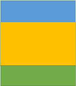
.layer1{width:100%; height:100px; background:blue;color:white;text-align:center;}
.layer2{width:100%; height:200px; background:yellow;color:blue;text-align:center;text-align:center;}
.layer3{width:100%; height:130px; background:green;color:white;text-align:center;}
</style>
</head>
<body>
<div class="layer1"><h1>顶部</h1></div>
<div class="layer2">
</div>
<div class="layer3">底部</div>
</body>
</html>
- 代码2:
 <!DOCTYPE html PUBLIC "-//W3C//DTD XHTML 1.0 Transitional//EN" "http://www.w3.org/TR/xhtml1/DTD/xhtml1-transitional.dtd">
 <html xmlns="http://www.w3.org/1999/xhtml">
    <head>
       <meta http-equiv="Content-Type" content="text/html; charset=gb2312" />
       <title>无标题文档</title>
       <style type="text/css">
          *{margin:0;padding:0;}
           .layer1{width:100%; height:100px;  background:blue;color:white;text-align:center;}
           .layer2{}

           .layer2-1{width:30%; height:200px; background:red;text-align:center;float:left;}
           .layer2-2{width:70%; height:200px; background:orange;text-align:center;float:left;}
           .layer2-3{clear:both;}
           .layer3{width:100%; height:130px;  background:green;color:white;text-align:center;}
       </style>
    </head>
    <body>
       <div class="layer1"><h1>顶部</h1></div>
       <div class="layer2">
            <div class="layer2-1"><h2>中间左部</h2></div>
            <div class="layer2-2"><h2>中间左部</h2></div>
            <div class="layer2-3"></div>
       </div>
       <div class="layer3">底部</div>
    </body>
 </html>
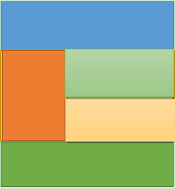
- 代码3:
<!DOCTYPE html PUBLIC "-//W3C//DTD XHTML 1.0 Transitional//EN" "http://www.w3.org/TR/xhtml1/DTD/xhtml1-transitional.dtd">
<html xmlns="http://www.w3.org/1999/xhtml">
<head>
<meta http-equiv="Content-Type" content="text/html; charset=gb2312" />
<title>无标题文档</title>
<style type="text/css">
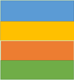
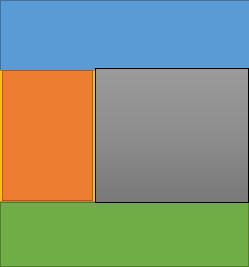
*{margin:0;padding:0;}
.layer1{width:100%; height:100px; background:blue;color:white;text-align:center;}
.layer2{}
.layer2-1{width:30%; height:200px; background:red;text-align:center;float:left;}
.layer2-2{width:70%; height:200px; float:left;}
.layer2-2-1{width:100%;height:100px;background:lightgreen;}
.layer2-2-2{width:100%;height:100px;background:lightblue;}
.layer2-3{clear:both;}
.layer3{width:100%; height:130px; background:green;color:white;text-align:center;}
</style>
</head>
<body>
<div class="layer1"><h1>layer1</h1></div>
<div class="layer2">
<div class="layer2-1"><h2>layer2-1</h2></div>
<div class="layer2-2">
<div class="layer2-2-1"><h2>layer2-2-1</h2></div>
<div class="layer2-2-2"><h2>layer2-2-2</h2></div>
</div>
<div class="layer2-3"></div>
</div>
<div class="layer3"><h2>layer3</h2></div>
</body>
</html>
盒子内元素的浮动
盒子内部的水平排列
- 给盒子内部需要浮动的盒子添加float属性,则元素将在盒子内部浮动(水平排列)
- 盒子的浮动有时候会产生一些问题,比方说高度塌陷。
盒子的高度塌陷
- 盒子的高度塌陷需要满足的条件有两个:
 第一,盒子的高度被设置为auto;
 第二,盒子中所有子元素都是浮动的。
- 例子:
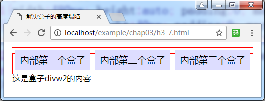
- 源代码:

 <html>
  <head>
<meta http-equiv="Content-Type" content="text/html; charset=gb2312" />
<title>盒子的高度塌陷</title>
<style type="text/css">
  .divw1{width:480px; height:auto; padding:0; margin:10px auto; border:1px solid #f00;}
  .divn{width:150px; height:40px; padding:0; margin:5px; background:#ddf; float:left; font-size:14pt; text-align:center; line-height:40px;}
  .divw2{width:480px; height:40px; padding:0; margin:10px auto; border:1px solid #f00;}
</style>
</head>
<body>
  <div class="divw">
    <div class="divn">内部第一个盒子</div>
	<div class="divn">内部第二个盒子</div>
	<div class="divn">内部第三个盒子</div>
  </div>
  <div class="divw2">这是盒子divw2的内容</div>
</body>
</html>
- 盒子塌陷产生的原因:
三个向左浮动的盒子本身是不占据空间的,相当于父元素divw1是一个空元素,而作为父元素的盒子divw1高度为auto,也就是没有设置,从而导致的后果是divw1和它的三个子元素都没有占据实际的页面空间,divw1的后继元素将会上移填补,所以出现图3-14所示的divw2上移的情况(盒子上移指的是边框、背景等上移,但是其内部文本将无法上移),这就是所谓的高度塌陷问题。
- 盒子的高度塌陷问题需要使用清除浮动的样式属性clear来解决。
 第一步,在样式中定义.clear{clear:both;},选择符的名称可以改变,类型也可以是id选择符,样式属性clear的取值可以根据实际情况使用left或者right。

 第二步,在作为父元素的盒子内部最下方增加一个空白盒子,引用定义的class类选择符clear即可。
返回 网页设计与开发