盒子的嵌套布局
来自CloudWiki
前情回顾
盒子的嵌套布局
- 以上两种布局,在进行简单网页设计的时候还可以
- 但是在进行比较复杂的布局的时候往往力不从心:
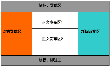

盒子的嵌套技术
- 盒子嵌套:在大盒子中嵌套小盒子
- 思想:体现的是模块化设计思想
- 具体方法:我们可以先在网页中用大一点的盒子进行框架的布局,然后再将每个盒子划分为更小的盒子,这就是盒子的嵌套。
嵌套元素竖直排列
- 这种情况下最简单,
- 当盒子内部的元素需要竖直排列时,不需要增加额外的属性,盒子内的元素按先后顺序上下排列。

- 源代码:

   <!DOCTYPE html PUBLIC "-//W3C//DTD XHTML 1.0 Transitional//EN" "http://www.w3.org/TR/xhtml1/DTD/xhtml1-transitional.dtd">
 <html xmlns="http://www.w3.org/1999/xhtml">
    <head>
       <meta http-equiv="Content-Type" content="text/html; charset=gb2312" />
       <title>无标题文档</title>
       <style type="text/css">
          *{margin:0;padding:0;}

           .layer2{width:100%; height:200px;}

           .layer2-1{width:100%; height:100px; background:red;text-align:center;}
           .layer2-2{width:100%; height:100px; background:orange;text-align:center;}
       </style>
    </head>
    <body>

       <div class="layer2">
            <div class="layer2-1"><h2>盒子2-1</h2></div>
            <div class="layer2-2"><h2>盒子2-2</h2></div>

       </div>

    </body>
 </html>
嵌套元素水平排列
- 这种情况稍微复杂一点
- 当盒子内部的元素需要水平排列时,要给需要浮动的元素添加float属性;同时,要在盒子内部的最后,增加一个空白盒子,将其属性设置为clear:both。

- 源代码:

<!DOCTYPE html PUBLIC "-//W3C//DTD XHTML 1.0 Transitional//EN" "http://www.w3.org/TR/xhtml1/DTD/xhtml1-transitional.dtd">
  <html xmlns="http://www.w3.org/1999/xhtml">
    <head>
       <meta http-equiv="Content-Type" content="text/html; charset=gb2312" />
       <title>无标题文档</title>
       <style type="text/css">
          *{margin:0;padding:0;}

           .layer2{width:100%;}

           .layer2-1{width:40%; height:200px; background:red;text-align:center;float:left;}
           .layer2-2{width:60%; height:200px; background:orange;text-align:center;float:left;}
           .layer2-3{clear:both;}

       </style>
    </head>
    <body>

       <div class="layer2">
            <div class="layer2-1"><h2>盒子2-1</h2></div>
            <div class="layer2-2"><h2>盒子2-2</h2></div>
            <div class="layer2-3"></div>
       </div>

    </body>
 </html>