Bootstrap 表单
来自CloudWiki
目录
表单布局
Bootstrap 提供了下列类型的表单布局:
- 垂直表单(默认)
- 内联表单
- 水平表单
垂直或基本表单
基本的表单结构是 Bootstrap 自带的,个别的表单控件自动接收一些全局样式。下面列出了创建基本表单的步骤:
- 向父 <form> 元素添加 role="form"。
- 把标签和控件放在一个带有 class .form-group 的 中。这是获取最佳间距所必需的。
- 向所有的文本元素 <input>、<textarea> 和 <select> 添加 class ="form-control"。
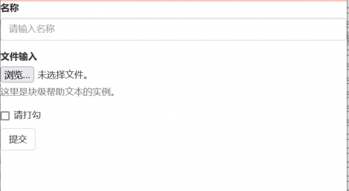
<!DOCTYPE html>
<html>
<head>
	<meta charset="utf-8">
	<title>Bootstrap 实例 - 基本表单</title>
	<link rel="stylesheet" href="https://cdn.staticfile.org/twitter-bootstrap/3.3.7/css/bootstrap.min.css">
	<script src="https://cdn.staticfile.org/jquery/2.1.1/jquery.min.js"></script>
	<script src="https://cdn.staticfile.org/twitter-bootstrap/3.3.7/js/bootstrap.min.js"></script>
</head>
<body>

<form role="form">
	<div class="form-group">
		<label for="name">名称</label>
		<input type="text" class="form-control" id="name"
			   placeholder="请输入名称">
	</div>
	<div class="form-group">
		<label for="inputfile">文件输入</label>
		<input type="file" id="inputfile">
		<p class="help-block">这里是块级帮助文本的实例。</p>
	</div>
	<div class="checkbox">
		<label>
			<input type="checkbox"> 请打勾
		</label>
	</div>
	<button type="submit" class="btn btn-default">提交</button>
</form>

</body>
</html>
效果图:
内联表单
如果需要创建一个表单,它的所有元素是内联的,向左对齐的,标签是并排的,请向 <form> 标签添加 class .form-inline。
<!DOCTYPE html>
<html>
<head>
	<meta charset="utf-8">
	<title>Bootstrap 实例 - 内联表单</title>
	<link rel="stylesheet" href="https://cdn.staticfile.org/twitter-bootstrap/3.3.7/css/bootstrap.min.css">
	<script src="https://cdn.staticfile.org/jquery/2.1.1/jquery.min.js"></script>
	<script src="https://cdn.staticfile.org/twitter-bootstrap/3.3.7/js/bootstrap.min.js"></script>
</head>
<body>

<form class="form-inline" role="form">
	<div class="form-group">
		<label class="sr-only" for="name">名称</label>
		<input type="text" class="form-control" id="name"
			   placeholder="请输入名称">
	</div>
	<div class="form-group">
		<label class="sr-only" for="inputfile">文件输入</label>
		<input type="file" id="inputfile">
	</div>
	<div class="checkbox">
		<label>
			<input type="checkbox"> 请打勾
		</label>
	</div>
	<button type="submit" class="btn btn-default">提交</button>
</form>

</body>
</html>
- 默认情况下,Bootstrap 中的 input、select 和 textarea 有 100% 宽度。在使用内联表单时,您需要在表单控件上设置一个宽度。
- 使用 class .sr-only,您可以隐藏内联表单的标签。

水平表单
水平表单与其他表单不仅标记的数量上不同,而且表单的呈现形式也不同。如需创建一个水平布局的表单,请按下面的几个步骤进行:
- 向父 <form> 元素添加 class .form-horizontal。
- 把标签和控件放在一个带有 class .form-group 的 <div> 中。
- 向标签添加 class .control-label。
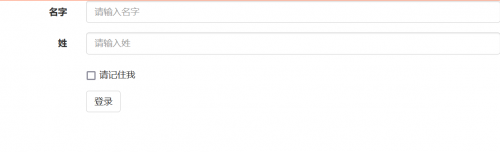
<!DOCTYPE html>
<html>
<head>
	<meta charset="utf-8">
	<title>Bootstrap 实例 - 水平表单</title>
	<link rel="stylesheet" href="https://cdn.staticfile.org/twitter-bootstrap/3.3.7/css/bootstrap.min.css">
	<script src="https://cdn.staticfile.org/jquery/2.1.1/jquery.min.js"></script>
	<script src="https://cdn.staticfile.org/twitter-bootstrap/3.3.7/js/bootstrap.min.js"></script>
</head>
<body>

<form class="form-horizontal" role="form">
	<div class="form-group">
		<label for="firstname" class="col-sm-2 control-label">名字</label>
		<div class="col-sm-10">
			<input type="text" class="form-control" id="firstname"
				   placeholder="请输入名字">
		</div>
	</div>
	<div class="form-group">
		<label for="lastname" class="col-sm-2 control-label">姓</label>
		<div class="col-sm-10">
			<input type="text" class="form-control" id="lastname"
				   placeholder="请输入姓">
		</div>
	</div>
	<div class="form-group">
		<div class="col-sm-offset-2 col-sm-10">
			<div class="checkbox">
				<label>
					<input type="checkbox"> 请记住我
				</label>
			</div>
		</div>
	</div>
	<div class="form-group">
		<div class="col-sm-offset-2 col-sm-10">
			<button type="submit" class="btn btn-default">登录</button>
		</div>
	</div>
</form>

</body>
</html>
支持的表单控件
Bootstrap 支持最常见的表单控件,主要是 input、textarea、checkbox、radio 和 select。
输入框(Input)
最常见的表单文本字段是输入框 input。用户可以在其中输入大多数必要的表单数据。Bootstrap 提供了对所有原生的 HTML5 的 input 类型的支持,包括:text、password、datetime、datetime-local、date、month、time、week、number、email、url、search、tel 和 color。适当的 type 声明是必需的,这样才能让 input 获得完整的样式。
    <form role="form">
        <div class="form-group col-sm-8">
            <label for="name">标签</label>
            <input type="text" class="form-control" placeholder="文本输入">
        </div>
     </form>
文本框(Textarea)
当您需要进行多行输入的时,则可以使用文本框 textarea。必要时可以改变 rows 属性(较少的行 = 较小的盒子,较多的行 = 较大的盒子)。
<div class="form-group ">
            <label for="name">文本框</label>
            <textarea class="form-control" rows="3"></textarea>
        </div>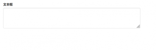
复选框(Checkbox)和单选框(Radio
复选框和单选按钮用于让用户从一系列预设置的选项中进行选择。
- 当创建表单时,如果您想让用户从列表中选择若干个选项时,请使用 checkbox。如果您限制用户只能选择一个选项,请使用 radio。
- 对一系列复选框和单选框使用 .checkbox-inline 或 .radio-inline class,控制它们显示在同一行上。
下面的实例演示了这两种类型(默认和内联):
默认的复选框和单选按钮:
        <div class="form-group">
                    <label for="name">默认的复选框和单选按钮的实例</label>
                    <div class="checkbox">
                        <label><input type="checkbox" value="">选项 1</label>
                    </div>
                    <div class="checkbox">
                        <label><input type="checkbox" value="">选项 2</label>
                    </div>
                    <div class="radio">
                        <label>
                            <input type="radio" name="optionsRadios" id="optionsRadios1" value="option1" checked> 选项 1
                        </label>
                    </div>
                    <div class="radio">
                        <label>
                            <input type="radio" name="optionsRadios" id="optionsRadios2" value="option2">选项 2 - 选择它将会取消选择选项 1
                        </label>
                    </div>
        </div>
内联的复选框和单选按钮:
        <div class="form-group">
                    <label for="name">内联的复选框和单选按钮的实例</label>
                    <div>
                        <label class="checkbox-inline">
                            <input type="checkbox" id="inlineCheckbox1" value="option1"> 选项 1
                        </label>
                        <label class="checkbox-inline">
                            <input type="checkbox" id="inlineCheckbox2" value="option2"> 选项 2
                        </label>
                        <label class="checkbox-inline">
                            <input type="checkbox" id="inlineCheckbox3" value="option3"> 选项 3
                        </label>
                        <label class="radio-inline">
                            <input type="radio" name="optionsRadiosinline" id="optionsRadios3" value="option1" checked> 选项 1
                        </label>
                        <label class="radio-inline">
                            <input type="radio" name="optionsRadiosinline" id="optionsRadios4"  value="option2"> 选项 2
                        </label>
                    </div>
        </div>
表单控件大小
您可以分别使用 class .input-lg 和 .col-lg-* 来设置表单的高度和宽度。
表单控件的高度
    <form role="form">
        <div class="form-group">
          <input class="form-control input-lg" type="text" placeholder=".input-lg">
        </div>
        <div class="form-group">
          <input class="form-control" type="text" placeholder="默认输入">
        </div>
        <div class="form-group">
          <input class="form-control input-sm" type="text" placeholder=".input-sm">
        </div>
        <div class="form-group"></div>
        <div class="form-group">
          <select class="form-control input-lg">
            <option value="">.input-lg</option>
          </select>
        </div>
        <div class="form-group">
          <select class="form-control">
            <option value="">默认选择</option>
          </select>
        </div>
        <div class="form-group">
          <select class="form-control input-sm">
            <option value="">.input-sm</option>
          </select>
        </div>
    </form>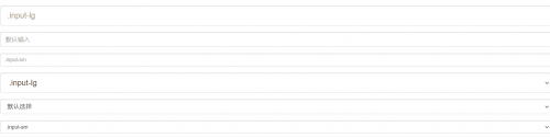
表单控件的宽度
    <form>
        <div class="row">
            <div class="col-lg-2">
            <input type="text" class="form-control" placeholder=".col-lg-2">
            </div>
            <div class="col-lg-3">
            <input type="text" class="form-control" placeholder=".col-lg-3">
            </div>
            <div class="col-lg-4">
            <input type="text" class="form-control" placeholder=".col-lg-4">
            </div>
        </div>
    </form>
参考文档: https://www.runoob.com/bootstrap/bootstrap-forms.html


