自适应网页之一
来自CloudWiki
目录
什么是响应式布局
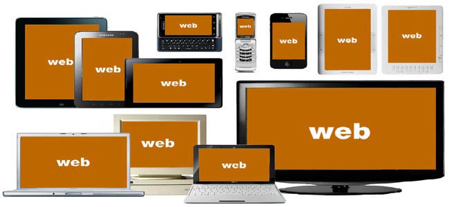
- 移动设备正超过桌面设备,成为访问互联网的最常见终端。于是,网页设计师不得不面对一个难题:如何才能在不同大小的设备上呈现同样的网页?
- 这就是响应式布局,设计一种页面,然后在多个终端上都能取得良好的访问效果。

响应式布局的实现
第一步,在HTML的头部加入meta标签
- 在HTML的头部,也就是head标签中增加meta标签,告诉浏览器网页宽度等于设备屏幕宽度,且不进行缩放,代码如下:
<meta name="viewport" content="width=device-width,user-scalable=no,initial-scale=1.0,maximum-scale=1.0,minimum-scale=1.0">
简单分析一下这一行代码的含义:width=device-width表示网页的宽度等于设备屏幕的宽度,initial-scale=1.0表示设置页面初始的缩放比例为1,user-scalable=no表示禁止用户进行缩放,maximum-scale=1.0 和 minimum-scale=1.0 表示设置最大的和最小的页面缩放比例。因为各大浏览器对meta标签的解析程度不一样,所以我们要尽可能的去兼容所有浏览器。
<!DOCTYPE html>
<html>
<head>
<meta name="viewport" content="width=device-width,user-scalable=no,initial-scale=1.0,maximum-scale=1.0,minimum-scale=1.0">
<title>无标题文档</title>
</head>
<body>
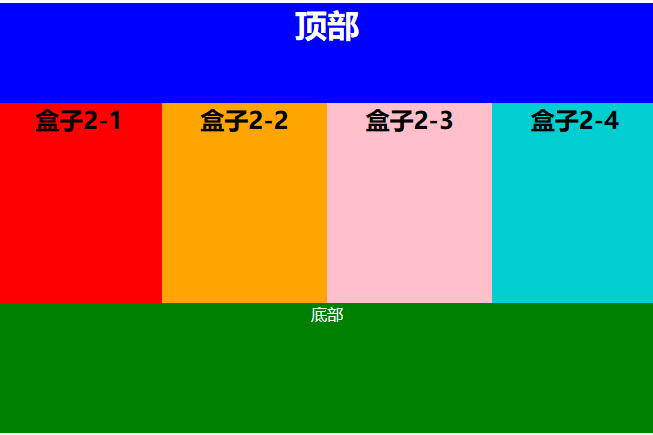
<div class="layer1"><h1>顶部</h1></div>
<div class="layer2">
<div class="layer2-1"><h2>盒子2-1</h2></div>
<div class="layer2-2"><h2>盒子2-2</h2></div>
<div class="layer2-3"><h2>盒子2-3</h2></div>
<div class="layer2-4"><h2>盒子2-4</h2></div>
<div class="clear">
</div>
<div class="layer3">底部</div>
</body>
</html>
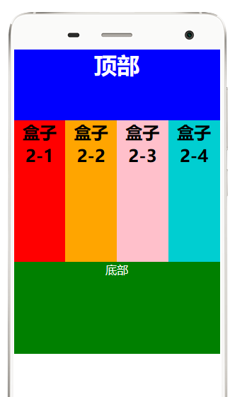
第2步,盒子的宽度尽量使用百分比布局
- 在页面布局中,相对宽度和绝对宽度相结合来进行布局,将更有利于网页的可维护性。
 .layer1{width:100%;height:100px;background:#39F;}
 .layer2-1{width:25%; height:200px; background:red;text-align:center;float:left;}
 .layer2-2{width:25%; height:200px; background:orange;text-align:center;float:left;}
 .layer2-3{width:25%; height:200px; background:pink;text-align:center;float:left;}
 .layer2-4{width:25%; height:200px;background:DarkTurquoise;text-align:center;float:left;}
 .clear{clear:both;}
 .layer3{width:100%;height:100px;background:#FC0;}
- 为了自适应,有内容的盒子的高度尽量设为auto;
- 源代码:

  <!DOCTYPE html>
 <html>
    <head>

       <meta name="viewport" content="width=device-width,user-scalable=no,initial-scale=1.0,maximum-scale=1.0,minimum-scale=1.0">
       <title>无标题文档</title>
       <style type="text/css">
          *{margin:0;padding:0;}
           .layer1{width:100%; height:100px;  background:blue;color:white;text-align:center;}
           .layer2{width:100%; }

           .layer2-1{width:25%; height:200px; background:red;text-align:center;float:left;}
           .layer2-2{width:25%; height:200px; background:orange;text-align:center;float:left;}
           .layer2-3{width:25%; height:200px; background:pink;text-align:center;float:left;}
           .layer2-4{width:25%; height:200px;background:DarkTurquoise;text-align:center;float:left;}
           .clear{clear:both;}
           .layer3{width:100%; height:130px;  background:green;color:white;text-align:center;}

       </style>
    </head>
    <body>
       <div class="layer1"><h1>顶部</h1></div>
       <div class="layer2">
            <div class="layer2-1"><h2>盒子2-1</h2></div>
            <div class="layer2-2"><h2>盒子2-2</h2></div>
            <div class="layer2-3"><h2>盒子2-3</h2></div>
            <div class="layer2-4"><h2>盒子2-4</h2></div>
            <div class="clear"></div>
       </div>
       <div class="layer3">底部</div>
    </body>
 </html>
第三步,在CSS代码中加入媒体查询
目前一般常见的实现响应式有两种方法,一种是利用媒体查询,另外一种是bootstrap下的栅格布局,以后介绍bootstrap的时候来介绍栅格布局,这里主要来说一下如何利用媒体查询实现响应式布局。
媒体查询,即 @media 查询,媒体查询可以针对不同的屏幕尺寸设置不同的样式,特别是如果你需要设计响应式的页面,@media 是非常有用的。当你重置浏览器大小的过程中,页面也会根据浏览器的宽度和高度重新渲染页面。因为是设置样式,所以将媒体查询相关的代码放在css文件的最下方即可。


- 将以下代码加到CSS中:


第四步,页面使用相对字体
在我们平常的网页布局过程中经常使用绝对单位像素(px)来进行布局,这样的布局不适合我们自适应网页的实现,所以我们现在来介绍两种常见的绝对单位em和rem
*{
	font-size:1.2em;
}