“导航条的制作”的版本间的差异
来自CloudWiki
| (未显示3个用户的52个中间版本) | |||
| 第1行: | 第1行: | ||
| + | ==背景知识== | ||
| + | *[[行内元素和块级元素]] | ||
| + | ==关于a标记== | ||
| + | *a标记为行内元素 | ||
| + | *可通过添加dispay:block或float:left属性,将它转换为块级元素 | ||
| + | *a元素成为一个块级框后,可以设置其区域大小、边框及边距。 | ||
| − | == | + | == 应用:导航条的制作 == |
| + | |||
| + | *导航条是建立在超链接的基础上的,我们在盒子中放置超链接,就构成了导航条 | ||
| + | *可以分为水平导航条和竖直导航条 | ||
| − | |||
| − | |||
| − | |||
| − | |||
| − | |||
== 水平导航条的实现 == | == 水平导航条的实现 == | ||
*[[文件:w4-16.png]] | *[[文件:w4-16.png]] | ||
| − | === | + | ===添加a标签=== |
*编写一个叫navigation的盒子,并在盒子中放置几个<a>标签 | *编写一个叫navigation的盒子,并在盒子中放置几个<a>标签 | ||
| − | <nowiki>< | + | |
| − | <div id="navigation"> | + | '''css:''' |
| − | + | <nowiki>#navigation { | |
| − | + | width:100%; | |
| − | + | height:4.6em; | |
| − | + | background-color:yellow; | |
| − | + | font:normal bold 100% "宋体"; | |
| − | </div> | + | |
| − | </ | + | } |
| + | </nowiki> | ||
| + | |||
| + | '''html :''' | ||
| + | |||
| + | <nowiki><div id="navigation"> | ||
| + | <a href="#">首页</a> | ||
| + | <a href="#">休闲零食</a> | ||
| + | <a href="#">日用百货</a> | ||
| + | <a href="#">服装鞋帽</a> | ||
| + | <a href="#">数码电子</a> | ||
| + | </div></nowiki> | ||
| + | |||
| + | ===将a标签转化为浮动块元素=== | ||
| + | 要是导航栏真正变成导航栏,链接需要变成按钮。 | ||
| + | |||
| + | '给a标记添加''' float:left;'''属性,变成浮动的块级元素,设置宽、高 | ||
| + | |||
| + | CSS: | ||
| + | |||
| + | <nowiki> #navigation a{ | ||
| + | width:18%; | ||
| + | height:4.6em; | ||
| + | float:left; | ||
| + | border:1px solid red; | ||
| + | |||
| + | }</nowiki> | ||
| + | |||
| + | |||
| + | |||
| + | ===设置水平垂直居中=== | ||
| + | |||
| + | 水平居中: | ||
| + | |||
| + | text-align:center; /* 这个属性使盒子中的链接居中 */ | ||
| + | |||
| + | 垂直居中: | ||
| + | |||
| + | <nowiki>height:4em; | ||
| + | line-height:4em;/*确保文字垂直居中*/</nowiki> | ||
| + | |||
| + | 或把行高属性集成到font属性中也可: | ||
| + | |||
| + | font:normal bold 100%/4.6em "宋体"; | ||
| + | |||
*效果图: | *效果图: | ||
| − | *[[文件: | + | *[[文件:web4-42.png]] |
| − | + | ||
| − | + | CSS: | |
| − | + | ||
| − | + | <nowiki> | |
| − | <nowiki>height: | + | #navigation a{ |
| − | line-height: | + | width:18%; |
| − | + | height:4.6em; | |
| − | <nowiki> | + | float:left; |
| − | * | + | border:1px solid red; |
| − | <nowiki>#navigation { | + | text-align:center; /* 这个属性使盒子中的链接居中 */ |
| − | + | line-height:4.6em; | |
| − | + | color:black;/*字体颜色*/ | |
| − | + | text-decoration: none; | |
| − | + | ||
| − | + | }</nowiki> | |
| − | + | ||
| + | ===设置悬停效果=== | ||
| + | |||
| + | |||
| + | 悬停效果: | ||
| + | |||
| + | <nowiki>#navigation a:hover{ /* 鼠标经过时 */ | ||
| + | background-color:blue; /* 改变背景色 */ | ||
| + | color:black; /* 改变文字颜色 */ | ||
| + | |||
| + | |||
| + | }</nowiki> | ||
| + | |||
| + | 效果图; | ||
| + | |||
| + | *[[文件:web4-43.png]] | ||
| + | |||
| + | 源代码: | ||
| + | |||
| + | <nowiki><!doctype html> | ||
| + | <html> | ||
| + | <head> | ||
| + | <title>商苑电商</title> | ||
| + | <meta charset="utf-8" /> | ||
| + | |||
| + | <style type="text/css"> | ||
| + | |||
| + | #navigation { | ||
| + | width:100%; | ||
| + | height:4.6em; | ||
| + | background-color:blue; | ||
| + | font:normal bold 100% "宋体"; | ||
| + | |||
| + | text-align:center; | ||
| + | line-height:4.6em; | ||
| + | } | ||
| + | |||
| + | #navigation a{ | ||
| + | color:#FFFFFF;/*字体颜色*/ | ||
| + | text-decoration: none; | ||
| + | float:left; | ||
| + | width:17%; | ||
| + | height:4.6em; | ||
| + | box-sizing:border-box; | ||
| + | line-height: 4.5em; | ||
| + | border:0.05em solid black; | ||
| + | border-left:1em solid #151571; | ||
| + | |||
| + | } | ||
| + | #navigation a:hover{ /* 鼠标经过时 */ | ||
| + | background-color:yellow; /* 改变背景色 */ | ||
| + | color:black; /* 改变文字颜色 */ | ||
| + | border-left:1em solid orange; | ||
| − | + | } | |
| − | } | + | </style> |
| − | + | </head> | |
| − | |||
| − | |||
| − | |||
| − | |||
| − | |||
| − | |||
| − | |||
| − | |||
| − | |||
| − | |||
| − | |||
| − | |||
| + | <body> | ||
| + | <div id="navigation"> | ||
| + | <a href="#">首页</a> | ||
| + | <a href="#">休闲零食</a> | ||
| + | <a href="#">日用百货</a> | ||
| + | <a href="#">服装鞋帽</a> | ||
| + | <a href="#">数码电子</a> | ||
| + | </div> | ||
| + | </body> | ||
| + | </html></nowiki> | ||
| + | ==垂直导航条的制作== | ||
| + | *[[文件:web4-44.png]] | ||
| + | *垂直导航条的实现也异常简单,分为4步 | ||
| − | |||
| − | |||
| − | |||
| − | |||
| − | |||
| − | |||
| − | |||
| − | |||
| − | |||
| − | |||
| − | |||
| − | |||
| − | |||
| − | |||
| − | |||
| − | |||
| − | |||
| − | |||
| − | |||
| − | |||
| − | |||
| − | |||
| − | |||
| − | |||
| − | |||
| − | + | ===添加a标签=== | |
| − | + | <nowiki><!DOCTYPE html> | |
| − | <nowiki><html> | + | <html> |
<head> | <head> | ||
| − | < | + | <meta http-equiv="Content-Type" content="text/html; charset=utf-8" /> |
| + | <style type="text/css"> | ||
| + | #navigation { | ||
| + | width:20%; | ||
| + | height:auto; | ||
| + | background:yellow; | ||
| + | } | ||
| + | </style> | ||
| + | <title>无标题文档</title> | ||
</head> | </head> | ||
| + | |||
<body> | <body> | ||
| − | <div id="navigation"> | + | |
| − | + | <div id="navigation"> | |
| − | + | <a href="#">首页</a> | |
| − | + | <a href="#">休闲零食</a> | |
| − | + | <a href="#">日用百货</a> | |
| − | + | <a href="#">服装鞋帽</a> | |
| − | </div> | + | <a href="#">数码电子</a> |
| + | </div> | ||
| + | |||
| + | </html> | ||
</body> | </body> | ||
</html></nowiki> | </html></nowiki> | ||
| − | === | + | ===将a 标签转化为块级元素=== |
| − | + | ||
| − | + | <nowiki> #navigation a{ | |
| − | <nowiki> | + | display:block; |
| − | + | width:100%; | |
| − | } | + | height:50px; |
| − | #navigation { | + | |
| − | + | background:blue; | |
| − | + | border:1px solid red; | |
| − | + | color:white; | |
| − | + | } | |
| − | + | </nowiki> | |
| − | + | ||
| − | + | ===设置水平垂直居中=== | |
| − | } | + | <nowiki> #navigation a{ |
| − | #navigation | + | display:block; |
| − | + | width:100%; | |
| − | + | height:50px; | |
| − | + | ||
| − | + | ||
| − | + | background:blue; | |
| − | + | border:1px solid red; | |
| − | + | color:white; | |
| − | + | ||
| − | # | + | text-align:center; |
| − | + | line-height:50px; | |
| − | + | text-decoration: none; | |
| − | + | border-left:20px solid green; | |
| − | } | + | }</nowiki> |
| − | #navigation | + | |
| − | + | ===设置悬停效果=== | |
| − | + | <nowiki> #navigation a:hover{ | |
| − | + | background: yellow; | |
| − | } | + | color:black; |
| + | border-left:20px solid red; | ||
| + | }</nowiki> | ||
| + | |||
| + | *完整代码如下: | ||
| + | <nowiki> | ||
| + | <!DOCTYPE html> | ||
| + | <html> | ||
| + | <head> | ||
| + | <meta charset="utf-8" /> | ||
| + | <title></title> | ||
| + | <style type="text/css"> | ||
| + | #navigation{ | ||
| + | width:20%; | ||
| + | height:300px; | ||
| + | background: yellow; | ||
| + | } | ||
| + | #navigation a{ | ||
| + | display:block; | ||
| + | width:100%; | ||
| + | height:50px; | ||
| + | background:blue; | ||
| + | border:1px solid red; | ||
| + | color:white; | ||
| + | text-align:center; | ||
| + | line-height:50px; | ||
| + | text-decoration: none; | ||
| + | border-left:20px solid green; | ||
| + | } | ||
| + | #navigation a:hover{ | ||
| + | background: yellow; | ||
| + | color:black; | ||
| + | border-left:20px solid red; | ||
| + | } | ||
| + | </style> | ||
| + | </head> | ||
| + | <body> | ||
| + | <div id="navigation"> | ||
| + | <a href="#">首页</a> | ||
| + | <a href="#">休闲零食</a> | ||
| + | <a href="#">日用百货</a> | ||
| + | <a href="#">服装鞋帽</a> | ||
| + | <a href="#">数码电子</a> | ||
| + | </div> | ||
| + | </body> | ||
| + | </html> | ||
| + | </nowiki> | ||
| + | |||
| + | '''思考''':如何使竖直导航条一直固定在页面的左侧 ? | ||
| + | |||
| + | ==手机和平板端的导航条== | ||
| + | *[[文件:w4-29.png]] | ||
| + | *在手机和平板电脑观看导航条时, | ||
| + | *垂直导航条跟在电脑上的效果是一样的,无需修改; | ||
| + | *水平导航条受屏幕宽度所限,需要在上面水平导航条代码的基础上添加以下内容: | ||
| + | <nowiki>/*当页面的宽度在900px ~ 1200px之间的时候,平板电脑屏*/ | ||
| + | @media screen and (min-width: 900px) and (max-width: 1200px){ | ||
| + | #navigation { | ||
| + | width:100%; | ||
| + | background-color:#FFFFFF; | ||
| + | font-size:2em; | ||
| + | } | ||
| + | #navigation a{ | ||
| + | width:30%; | ||
| + | } | ||
| + | |||
| + | |||
| + | } | ||
| + | /*当页面的宽度在600px ~ 900px之间的时候,手机屏*/ | ||
| + | @media screen and (min-width: 900px) and (max-width: 1200px){ | ||
| + | #navigation { | ||
| + | width:100%; | ||
| + | background-color:#FFFFFF; | ||
| + | font-size:2em; | ||
| + | } | ||
| + | #navigation a{ | ||
| + | width:45%; | ||
| + | } | ||
| + | |||
| + | } | ||
</nowiki> | </nowiki> | ||
| − | + | ||
| + | |||
| + | |||
返回 [[网页设计与开发]] | 返回 [[网页设计与开发]] | ||
2020年11月30日 (一) 01:58的最新版本
目录
背景知识
关于a标记
- a标记为行内元素
- 可通过添加dispay:block或float:left属性,将它转换为块级元素
- a元素成为一个块级框后,可以设置其区域大小、边框及边距。
应用:导航条的制作
- 导航条是建立在超链接的基础上的,我们在盒子中放置超链接,就构成了导航条
- 可以分为水平导航条和竖直导航条
水平导航条的实现

添加a标签
- 编写一个叫navigation的盒子,并在盒子中放置几个<a>标签
css:
  #navigation {
				width:100%;
				height:4.6em;
				background-color:yellow;
				font:normal bold 100%  "宋体";

            }
html :
<div id="navigation">
			<a href="#">首页</a>
			<a href="#">休闲零食</a>
			<a href="#">日用百货</a>
			<a href="#">服装鞋帽</a>
			<a href="#">数码电子</a>
		</div>
将a标签转化为浮动块元素
要是导航栏真正变成导航栏,链接需要变成按钮。
'给a标记添加 float:left;属性,变成浮动的块级元素,设置宽、高
CSS:
	 #navigation a{
		 width:18%;
		 height:4.6em;
		 float:left;
		 border:1px solid red;

	 }
设置水平垂直居中
水平居中:
text-align:center; /* 这个属性使盒子中的链接居中 */
垂直居中:
height:4em;
line-height:4em;/*确保文字垂直居中*/
或把行高属性集成到font属性中也可:
font:normal bold 100%/4.6em "宋体";
- 效果图:
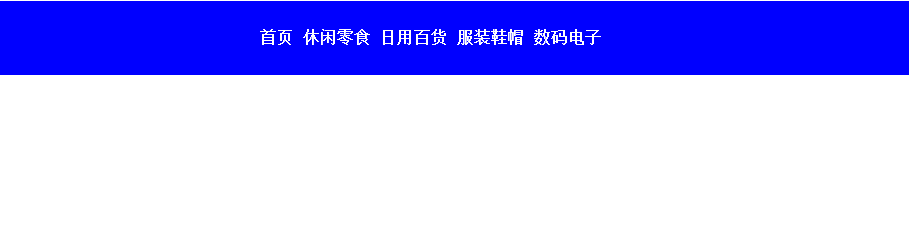

CSS:
    #navigation a{
		 width:18%;
		 height:4.6em;
		 float:left;
		 border:1px solid red;
		 text-align:center; /* 这个属性使盒子中的链接居中 */
		 line-height:4.6em;
		 color:black;/*字体颜色*/
                 text-decoration: none;

	 }
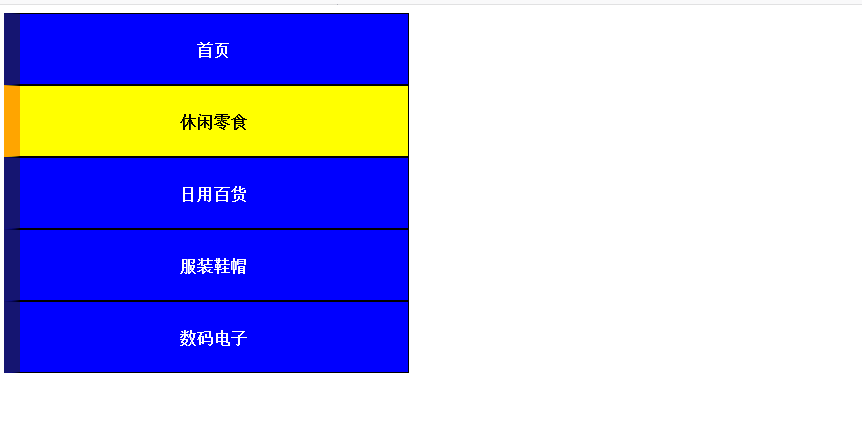
设置悬停效果
悬停效果:
#navigation  a:hover{					/* 鼠标经过时 */
				background-color:blue;			/* 改变背景色 */
				color:black;						/* 改变文字颜色 */


  			}
效果图;

源代码:
<!doctype html>
<html>
	<head>
		<title>商苑电商</title>
		<meta charset="utf-8" />

                <style type="text/css">

   #navigation {
				width:100%;
				height:4.6em;
				background-color:blue;
				font:normal bold 100%  "宋体";

				text-align:center;
				line-height:4.6em;
   }

   #navigation a{
            	color:#FFFFFF;/*字体颜色*/
            	text-decoration: none;
				float:left;
				width:17%;
				height:4.6em;
				box-sizing:border-box;
				line-height: 4.5em;
				border:0.05em solid black;
			    border-left:1em solid #151571;

   }
   #navigation  a:hover{					/* 鼠标经过时 */
				background-color:yellow;			/* 改变背景色 */
				color:black;						/* 改变文字颜色 */
				border-left:1em solid orange;

  	}
</style>
</head>

<body>
    <div id="navigation">
			<a href="#">首页</a>
			<a href="#">休闲零食</a>
			<a href="#">日用百货</a>
			<a href="#">服装鞋帽</a>
			<a href="#">数码电子</a>
	</div>
</body>
</html>
垂直导航条的制作
- 垂直导航条的实现也异常简单,分为4步

添加a标签
<!DOCTYPE html>
<html>
<head>
<meta http-equiv="Content-Type" content="text/html; charset=utf-8" />
<style type="text/css">
     #navigation {
		 width:20%;
		 height:auto;
		 background:yellow;
	 }

</style>
<title>无标题文档</title>
</head>

<body>

	<div id="navigation">
			<a href="#">首页</a>
			<a href="#">休闲零食</a>
			<a href="#">日用百货</a>
			<a href="#">服装鞋帽</a>
			<a href="#">数码电子</a>
	</div>

</html>
</body>
</html>
将a 标签转化为块级元素
  #navigation a{
		 display:block;
                 width:100%;
		 height:50px;

		 background:blue;
		 border:1px solid red;
		 color:white;
	  }
设置水平垂直居中
	 #navigation a{
		 display:block;
                 width:100%;
		 height:50px;


		 background:blue;
		 border:1px solid red;
		 color:white;

		 text-align:center;
		 line-height:50px;
		 text-decoration: none;
		 border-left:20px solid green;
	 }
设置悬停效果
  #navigation a:hover{
				 background: yellow;
				 color:black;
				 border-left:20px solid red;
			 }
- 完整代码如下:
<!DOCTYPE html>
<html>
	<head>
		<meta charset="utf-8" />
		<title></title>
		<style type="text/css">
             #navigation{
				 width:20%;
				 height:300px;
				 background: yellow;
			 }
			 #navigation a{
				 display:block;
				 width:100%;
				 height:50px;
				 background:blue;
				 border:1px solid red;
				 color:white;
				 text-align:center;
				 line-height:50px;
				 text-decoration: none;
				 border-left:20px solid green;
			 }
			 #navigation a:hover{
				 background: yellow;
				 color:black;
				 border-left:20px solid red;
			 }
		</style>
	</head>
	<body>
		<div id="navigation">
			<a href="#">首页</a>
			<a href="#">休闲零食</a>
			<a href="#">日用百货</a>
			<a href="#">服装鞋帽</a>
			<a href="#">数码电子</a>
		</div>
	</body>
</html>
思考:如何使竖直导航条一直固定在页面的左侧 ?
手机和平板端的导航条
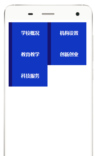
- 在手机和平板电脑观看导航条时,
- 垂直导航条跟在电脑上的效果是一样的,无需修改;
- 水平导航条受屏幕宽度所限,需要在上面水平导航条代码的基础上添加以下内容:

 /*当页面的宽度在900px ~ 1200px之间的时候,平板电脑屏*/
         @media screen and (min-width: 900px) and (max-width: 1200px){
            #navigation {
	          width:100%;
		  background-color:#FFFFFF;
		  font-size:2em;
	    }
	 #navigation a{
	          width:30%;
		}


         }
         /*当页面的宽度在600px ~ 900px之间的时候,手机屏*/
        @media screen and (min-width: 900px) and (max-width: 1200px){
            #navigation {
	          width:100%;
		  background-color:#FFFFFF;
		  font-size:2em;
	    }
	 #navigation a{
	          width:45%;
		}

         }
返回 网页设计与开发